Offers.com
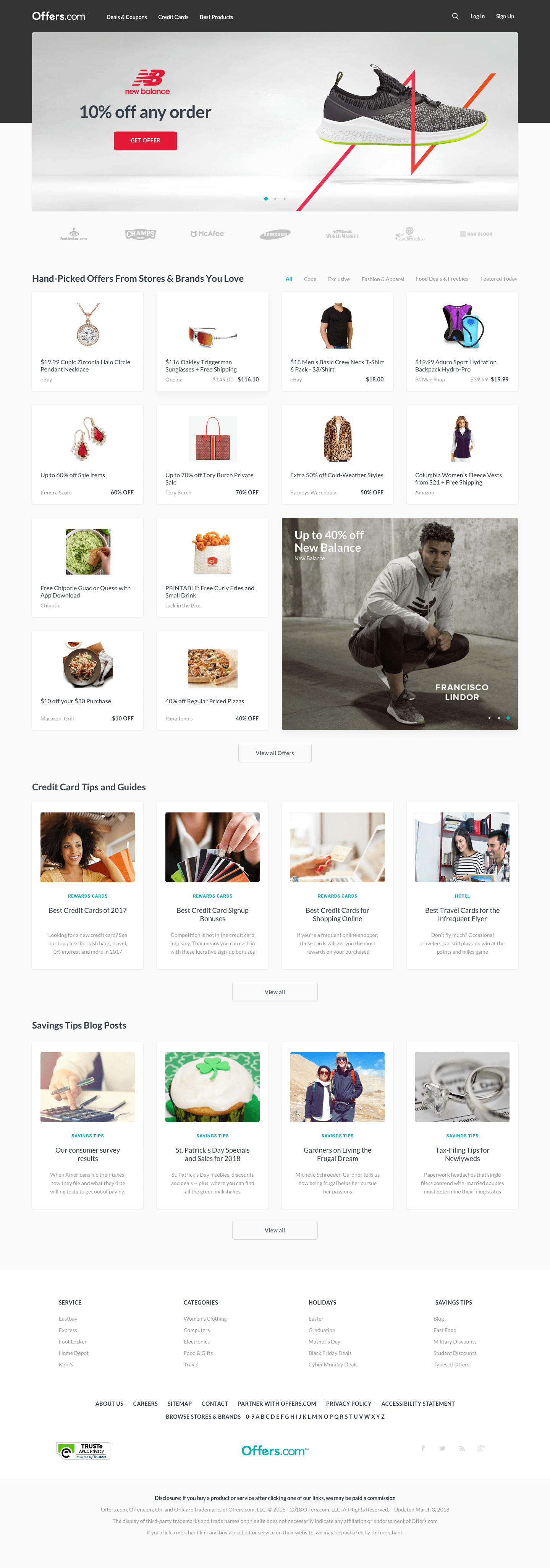
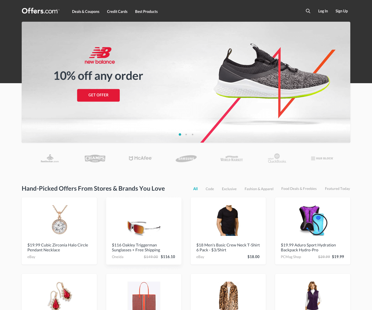
Site redesign for an online marketplace which finds the best coupons, discounts, and deals for customers.
Kick-off meeting
Some time ago, I was in a meeting which involved a product manager, a lead engineer, a marketing director, and myself. From the business standpoint, it was identified that the site was not performing as well as it was projected. We were provided the following things to keep in mind:
- Demographics
- Fixed income for older adults
- Shoppers wanted easy access to coupon codes and discounts
- Shoppers want a fast and efficient shopping experience
- Constraints
-
- Must have prominent ad space on the homepage
- Must accommodate for SEO
- Assumptions
-
- Shoppers are unclear when they are going to another site
- Shoppers are overwhelmed with the current sites visual appearance
As a result, the goal was to improve these metrics:
- Click-through rate
- Overall conversion rate
- Organic traffic
Research
In order to gain as much insight as possible from the customers, I utilized several methods up my sleeve:
- UserTesting.com
- The customers indicated that the site was loading slowly and at times just wanted to leave.
- They were overwhelmed with the vast amount of content available which made it hard on where to start.
- Card sorting
- I was able to run some sessions to gather enough data to confirm how the site was being navigated.
- Competitive analysis
- After researching our top 5 competitors, they generally had the same flow. The notable differences were the following:
- Some sites loaded faster the others
- Different placements of their ads
- Obvious different UI aesthetics for their branding
- Some emphasized the search bar more than others
- There are SEO influences on the page layouts which I had our marketing director confirm
- After researching our top 5 competitors, they generally had the same flow. The notable differences were the following:
Brainstorming
In order to digest all the data we’ve accumulated, I’ve facilitated several brainstorm sessions where we jotted everything on post-it notes and then we synthesized our findings.
Collaborative ideas:
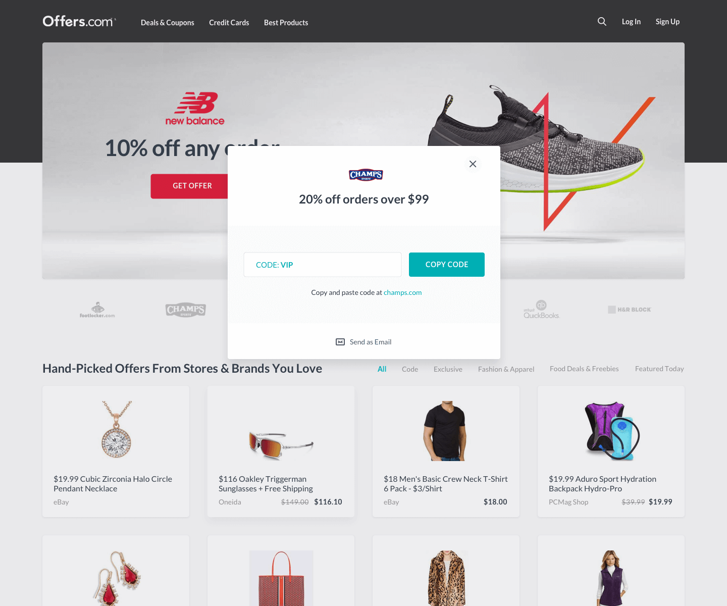
- Clear messaging where it tells the shopper when they’re about to leave the site
- Remove unnecessary visual badges and tags
- Fewer colors in the background so that shoppers can focus more on the product or deal
- Remove extra special effects to lighten the weight on the code-side to allow the site to load faster
- Simplify typography so that shoppers can easily digest the right content that they’re looking for
Design Mockups
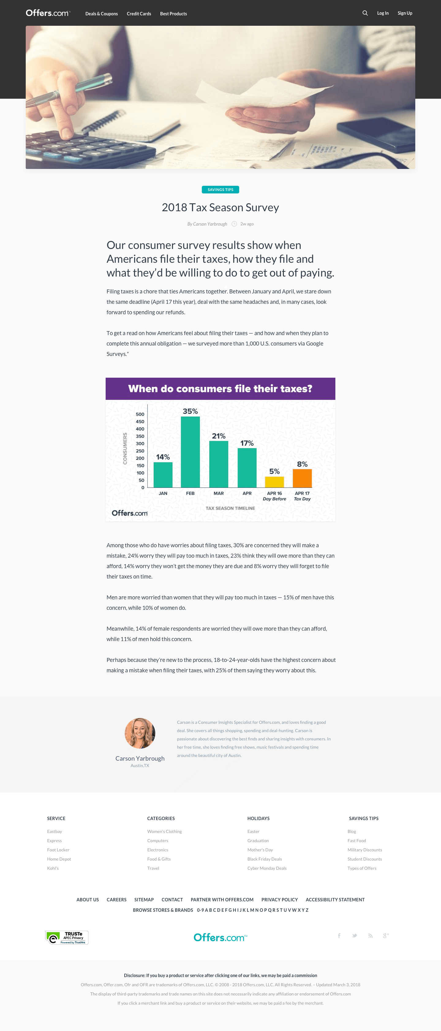
I gathered all the ideas produced and started to create wireframe variations. Based on the list of elements that we needed to put into the pages, it all came down to layouts. It took a bit of fiddling to make sure marketing’s, developer’s, and product needs were met. Once the content and layouts were locked down in wireframe mode, I went ahead and created several design variations in high fidelity interactive prototypes.
Conclusion
With several prototypes available, I used UserTesting.com again to run some usability tests for each. One of the designs came back with the best feedback in which had minimal change requests. We decided to move forward with this design because the data from the usability tests indicated that this design would improve the overall metrics.
