PLANOLY
Designed and implemented a more robust User Tag Manager to help improve workflow and efficiency for Instagramers.
Background
PLANOLY is a social marketing platform to visually plan, schedule, and measure performance across Instagram and Pinterest.
Design Opportunity
Look for the opportunity to improve workflow and increase efficiency.
Success Metrics
- Increasing usage of tagging users’ feature
- KPI: % of users who tag users coming from group tags
Timeline
2 months (4 bi-weekly sprints)
Kickoff Meeting
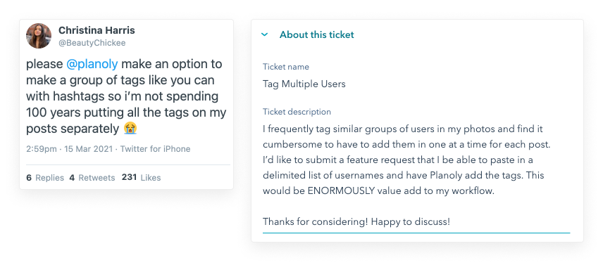
The journey started in a weekly huddle with the Product Owner I was paired with. After we reviewed works-in-progress, she introduced a new project that we’ll be working on by showing screenshots of customer feature feedback and a customer support ticket.

Problem Alignment
The team needed to be aligned with the problem:
What problem will this solve for our customers? (customer problem)
A successful Instagram strategy is to tag users in posts to gain attention which drives traffic. The problem with PLANOLY’s current tagging feature is that users must repetitively type or copy/paste usernames. In addition, the app had limited, non-cross-platform 10-user search history that is locally cached.
What business objective is this work intended to address? (objective)
The business objective was to encourage users to stick more with PLANOLY because of an improved workflow and increased efficiency. What’s more, competitors lack this feature.
What type of customer are we focused on? (target market)
While photographers commonly ask about this feature, this applies to any user on the PLANOLY platform who frequently experiences frustration entering the same usernames repeatedly. This feature is expected to become a standard way of tagging users.
Research
We conducted additional exploratory calls and usability tests to further validate our direction. There was one piece of feedback that summed it all up:
Thanks again for reaching out. It was great talking to your team and seeing some exciting changes coming to Planoly! One thing I neglected to mention, besides being able to save user tag groups, is that I can use Planoly on multiple devices. Right now since it just stores a cache of submitted names unique to each specific device (ordered recent -> oldest). The largest benefit to me will include organized tags that I can now use regardless of which device I’m on!
Solution Alignment
To have the same aligned solution with the following team:
- Product Owner
- Product Marketing
- iOS and Android Engineers
- Responsive Web Engineers
- BE Engineers
We went through a series of steps:
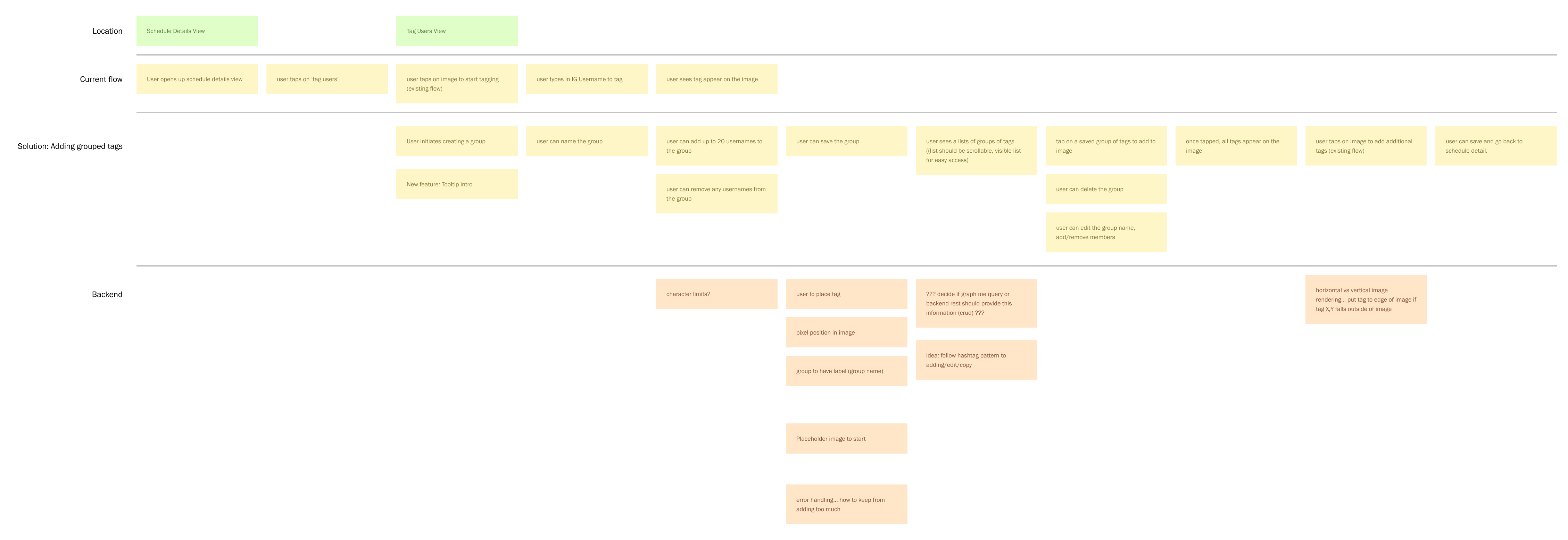
1) User Story Mapping
- to define the Key Features
- ability to create a group of user tags (up to 20)
- ability to create multiple groups of user tags
- To help Engineers understand and agree on technology capabilities and constraints. Some examples were the following:
- iOS may need to find a library or opt into a more simplified solution for username input into groups – what was needed was understanding the effort.
- Mobile devs debated on what technology to track the feature adoption.
- to create initial User Stories for the Product Owner
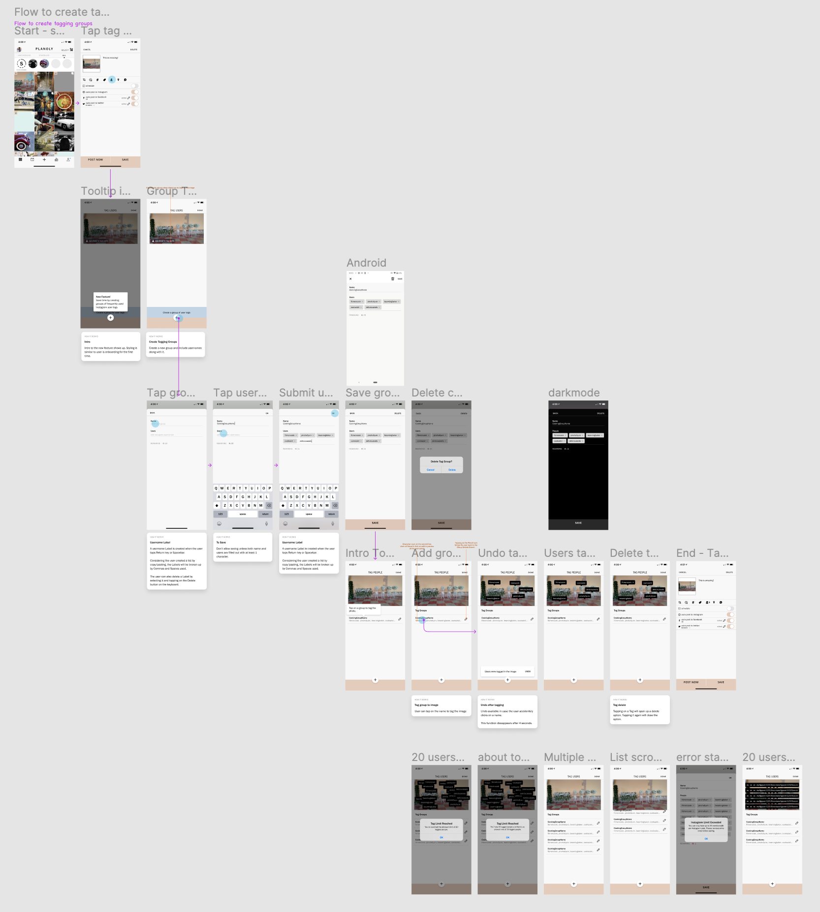
2) User Flows with HiFi Mobile & Web Mockups
- To visualize the user story map and further discover overlooked technology and user flow conditions for engineers
- to further define User Stories
- to provide context for Product Marketers to help with marketing text copies
- to have visual artifacts for company-wide demos
3) Interactive Mockups
- to clarify micro-interactions in addition to the user stories
Feedback & Iterations
The design cycles and iterations helped with customers’ feedback. A few challenges arose which led to enhanced flows:
- Since there was a limitation of 20, users were asking for an easy way to keep track of how many they’ve tagged.
- Solution: a counter of how many user tags were left
- For those who’ve used the user tag manager before but forgot the instructions.
- Solution: a help tooltip
- Customers were not aware that using autocomplete and tagging private profiles was not allowed with Instagram.
- Solution: a more explicit message with the use of helper text
Implementation
Our development environment was asynchronous, which meant the web went ahead of mobile for this project. This arrangement varied depending on milestones and resources. To succeed, we had to carefully plan, define, and design before and during the process. We ran into a few hiccups:
- iOS and Android had native differences, so additional, ambitious native behaviors were included, which were not agreed upon initially. On a positive note, we made it work!
- Timely rollouts for all platforms.
Launch Checklist
To cover our grounds, we had a launch checklist that included the following examples:
- Support
- Will new learning material be needed (or updates to existing documentation)? Help Center articles?
- YES
- Will this feature require new support processes, like saved replies, or training the support team on new products/changes?
- YES
- Will new learning material be needed (or updates to existing documentation)? Help Center articles?
- Product Marketing
- Are we running a Beta for this?
- NO
- Do we need an onboarding experience?
- YES
- Are we running a Beta for this?
- Legal
- Are any legal updates needed?
- NO
- Are any legal updates needed?
- Data
- Have you implemented sufficient tracking to measure success, risks, and impact on user behavior for the new feature?
- YES
- Have you implemented sufficient tracking to measure success, risks, and impact on user behavior for the new feature?
Outcome
After the two-month process, here was the launch output:
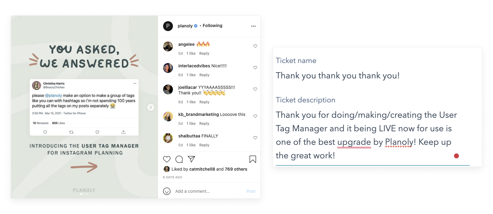
- 1st month: 3,177 users created 1+ group (total)
- 2nd month: 4,256 users created 1+ group (total)


